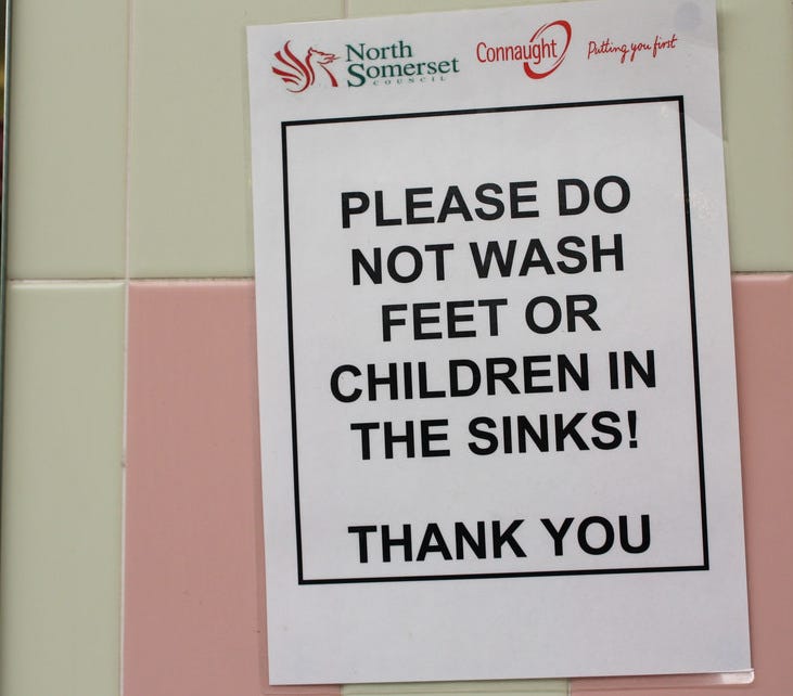
Do not wash your feet or children in the sink. Caution fire is hot.
Seeing the signage around in our everyday life often makes me think about the systems that exist (or don’t) that lead to the signs we take for granted. The signs that tell us what we should or shouldn't do, where to go to find something and where to go if we have lost something.

In Australia I find that our regulation around signage is quite complex but also quite interesting. I am currently playing a small part of a building project for our new Church auditorium (500 seats plus an extensive audio-visual production system across two buildings). After speaking with the site manager last week he explained some of the complex rules around hard hat signs. One such rule affects the liability on the construction company based on the position of the signage. If the sign for wearing a hard hat is at the front gate, then the company is liable (legally responsible to enforce) for everyone that goes past that point wearing hard hats. Hence they are very careful regarding the points at which they place these signs, feel free to read some more fun regulations here .
Preemptive Signage
In my observations the first grouping of signs in the wild have an aspect of forethought to them, either through regulation or some semblance of common sense. Let’s call these preemptive, they exist because someone preempted how others act, or rules are in place to regulate a general consensus on what people need to know and they are usually professionally printed and positioned accordingly.
It is a great example of systems in play, first there is the system that dictates the rules around signage, where should exit signs be placed, what distance between each speed sign is reasonable and does it change with the speed driven. How many signs should there be that direct people to toilets in public places? When you need to go, there are never enough signs for toilets though .

Most of the time this signage is effective as it has been thought through, expecting people need to know when to turn left or know which is a hand drier or urinal. Usually the symbols on these signs are reasonably universal.
Reactive Signage
The next set of signage is more organic, more raw and I like to think of it as reactive. These signs have been put in place after the fact, after the road is built or shopping centre opens. This kind of signage fascinates me and often makes me laugh — not sure if that means I have an odd sense of humour. These signs have no rule book, no ISO or building code to follow and usually are the result of an incident (or series of incidents) that caused enough frustration to the business owner, cleaner or management that someone deduced a sign is the perfect solution to this problem .

One of my favourite hand written signs from a recent trip to Thailand was “Do not strike or kick the bear” . This poor child sized plush bear in a Muay Thai outfit must be the perfect size for kids to come along and ‘kick & strike’, but whoever arranged the bear in the first place probably had not thought of that in advance. The obvious solution is to put a sign there.

Our hotel was amazing, and like many hotels breakfast is included with most rooms so we would wake up and join the masses in line for the fruit, egg station and of course those really cool conveyor belt toasters . I have noticed that alongside these special toasters there are always signs about not toasting croissants. I wonder how long after the hotel is built do they put this sign in place, it does not come with the toasting machine and is custom printed for each hotel. How many croissant fires are caused annually by people forcing their breakfast snack into something designed for bread only. Thankfully there is a sign to fix this pandemic of toasting incidents.
The cruel irony is that those same people who apparently need a sign to not do something simply dumb are the most likely to completely ignore the signs in the first place.
So we end up living in a world with signs that are meant to counter the random but seem to just add to that random. Maybe there should be signs about what signs can be put up?
But… Where should I wash my Feet?

My favourite sign to see custom printed or handwritten is the one in many international airport toilets advising that one should not wash their feet in the toilet, sink or anywhere else in the bathroom facilities. After reading about this (yes, it did fascinate me that much), I found that this is more a cultural gap of knowledge where the Muslim religion requires people clean their feet before praying. This custom was completely unknown to me and if I was planning the construction of an airport I would not have even had this on my radar of thinking. Alas, we have seen this sign—or something similar — at pretty much every international airport around South East Asia we have been to.
In the end it goes to show that you don’t know what you don't know , and when planning the perfect signage for a venue, bathroom or construction site — it is probably like any other system where the end picture is something that is impossible to truly plan from the start.
Finally I leave you with a completely random memory from my childhood, this guy pictured below — Mr. Fish — who spent his days writing angry signs for all the children who went through his hotel’s foyer. Plus a fun link bait article about ridiculous signs that show how stupid people can be .
